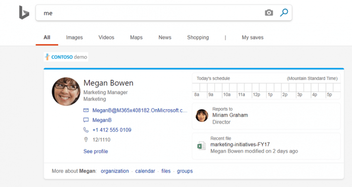
Importantly, Microsoft has taken pains to ensure the design layout is the same as its other applications. This should mean users will spend less time hunting around for the right information or sub-menus. The search engine also sports expanded views for profiles to tie in relevant information:
“We’ve linked your People card result to your Office profile. To see it, just search for ‘me’ and click See profile. From your profile, you can: Get more details: You’ll get more information, including ways people can contact you, people in your organization, your recent files, and recent emails. Filter files by type: Click the Files tab to see a list of your most recent files. To narrow your results, you can easily filter the list. Update your profile: To update old or incorrect information, click Update your profile. This link will take you to Delve where you can make any necessary changes.”
To optimize for this additional information, Microsoft has cut down on white space in its search engine. It should now be more compact, while occasionally showing work-focused search results at the top when you search for terms like LinkedIn Learning. “One goal of Microsoft Search is to make work information easy to find and to provide a search experience that’s seamless and familiar everywhere you search,” explained the company in a blog post. Enterprise users should see the updates functionality already, if not very soon. Microsoft didn’t announce any in-development features but is still looking for feedback.


