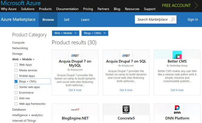
While the offering of cloud-apps there is being considered top-notch, there were growing complaints about its usability. With an increasing number of categories, app types and providers, searching for specific solutions had become more and more time-consuming. To improve the user experience, Microsoft has developed a whole new Azure Marketplace interface which should make things much easier. The search form now provides instant search suggestions for typed in words, sorted by relevance and popularity. With improved taxonomy and filters for categories and sub-categories discovering solutions is also much easier now, even if you have no concrete idea. Starting with general terms and then narrowing down the search is a good way to find the best solutions for each case.
As this works without logging into the Azure portal, research can be now done much quicker. Like in other app-stores, browsing the Azure Marketplace can be done by anybody. Only if you decide to test-drive or book a certain service, entering the Microsoft Azure portal is required by clicking on one of the two blue buttons below the app-logo.


