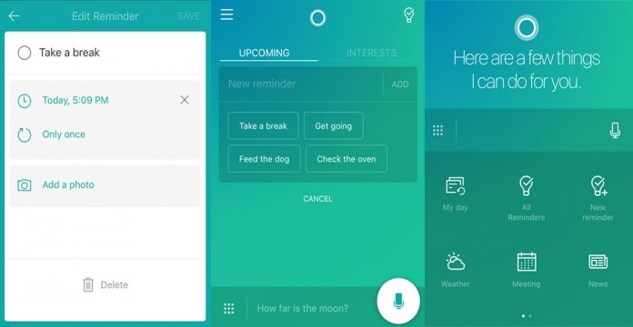
Most notable are the visual changes, which include frameless graphics and new, bold color themes. Like all good design tweaks, though, it also streamlines the interaction experience. The new reminder interface lets users create notes with a couple of taps, using AI suggestions for faster completion.
Increased Responsiveness
Meanwhile, a new profile page gives faster access to essential settings like app preferences. It’s a definite improvement over previous iterations and collects more information under single UI elements. Perhaps more important, however, is the responsiveness. Thanks to the update, Cortana for iOS feels much snappier. Part of that is down to performance improvements, but much is thanks to reduced animation times and faster page transitions. Of course, Microsoft has also fixed several bugs, but it also hints that this is just the start. At the bottom of the 2.6.0 changelog, it states:


