One of the main changes is Conversations – Outlook’s fast, interactive email experience. Small tweaks such as showing more of each message and opening to the first unread one make things instantly faster. You can also reply to everyone with a quick tap in the quick reply box, viewing the rest of the conversation as you reply. To reduce clutter, actions like forwarding are now found under a triple dot menu.
Outlook for iOS Navigation Improvements and Search
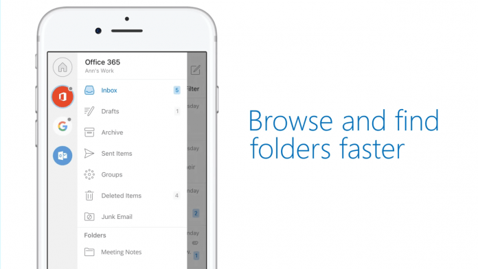
Microsoft has also made some changes to general navigation in Outlook, thanks to user feedback. The account submenu gives you faster access to all of your different accounts and makes it easier to see drafts, Groups, and more. It’s also much faster to modify things to your liking, the settings icon pinned to the left rather than hidden at the bottom of the screen. You can also use it to contact Microsoft’s support team from within the app. Despite all of these changes, some of the best are yet to come. Microsoft will soon implement its Graph functionality in Outlook for iOS, bringing some exciting new additions:
“Search will be front and center in the app’s simplified tab bar. No matter where you are, the new search will be a tap away. Our goal is to bring more proactive and contextual information to your fingertips without even needing to type in a search box. People and Files will be seamlessly integrated as part of the search experience. There’s a section for People and Files—both with proactive suggestions. When typing a name in the search box, it will instantly display suggestions from your most frequent contacts. Tapping on a person provides one-tap access to the new People card announced a few weeks ago.”
Of course, it’s all powered by Microsoft’s AI, serving up travel information, recent attachments. The final result will be a far more productive experience, but for now, you can get used to the new UI changes.


