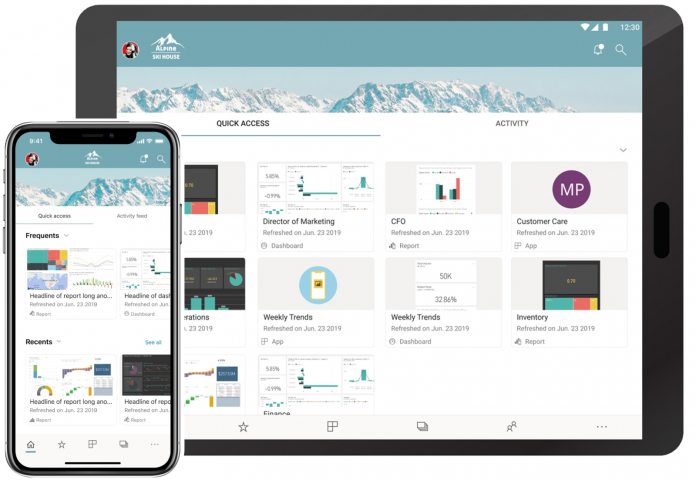
For example, Power Bi mobile now has home page to make accessing features simpler. From this central hub, users can select between two tabs, Quick Access and Activity. Furthermore, Power Bi mobile now has a new navigation bar that has replaced the Hamburger menu. Microsoft says the new method for accessing and navigating the app will make swapping pages more efficient. Finally, Microsoft says the top of the app page will now show the branding of the user’s organization. The company says this makes the visual experience more uniform across Power Bi variants.
Full Changelog
The new home page provides two tabs:
Quick access: Here you’ll have an easy and quick way to view and find your most commonly and recently accessed items in Power BI. Activity: here you’ll get a feed with events happening in your Power BI account that are relevant to you.
New navigation: Instead of using the top left “Hamburger” menu, you have a bottom navigation bar, providing you with an easy way to swap between pages and use your preferred way to find your content. If you’re interested in Power Bi mobile, you can download the app for iOS from the App Store here, or for Android from Google Play here. It is worth noting the new look Power Bi mobile experience is currently in public preview. It’s open to everyone, but the finalized app won’t be released until later.


