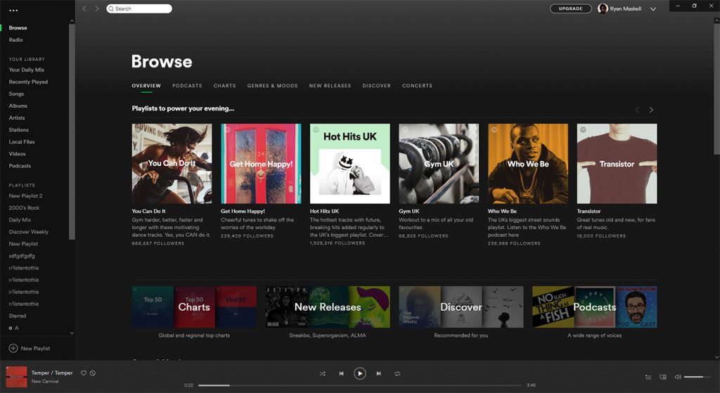
The design changes are only minor, but should greatly increase the quality of life for some users. Though the sidebar, music controls, and other elements are the same, refined account and settings menus have made an appearance. In the top left, there are now three large docks you can use to access file, edit, view, and more. At the top right is the account menu, which now sits slightly higher. You can see for yourself below:
Spotify also seems to be adopting parts of the Fluent Design System, integrating the minimize, maximize and exit buttons into the app’s UI. The app also fills the entire screen after switching to tablet mode, while the resizing of elements is much easier.
Android App Crackdown
Windows 10 is getting a lot of focus from Spotify, but aspects of the Android experience have also caught its attention. Years ago, Spotify intentionally built restrictions into its mobile app, forcing users to shuffle play songs and only allowing a limited amount of skips. Some users felt this was unfair, considering they listen to ads either way and began to deliver modified apps. After years of peaceful co-existence, Spotify has decided to crack down on those apps, threatening users who use them with bans. However, it’s unclear how well the tactic will fare, given user’s ability to create new accounts with temporary emails. Whatever the case, its good to see the Windows 10 app getting some love after so many have migrated.


